Reimagining Diggs: A Brand and Platform Transformation
Project Overview:
Diggs emerged from frustration with subpar dog products and a deep love for animals. Specializing in redefining dog crates and crate training, they aim to provide the best for dogs and their owners.
Driven by a team of pet parents and enthusiasts, Diggs combines safety, smart design, and real functional solutions. Their mission? To revolutionize pet ownership with thoughtful products that cater to both dogs and their human companions.
They represent a commitment to elevating the pet ownership experience, showcasing how responsible design can enhance the lives of both pets and people. Diggs’ vision extended beyond their products; they sought an online store that resonated with their mission of delivering the utmost for dog owners.
And just as the love for dogs brings people together, the shared pursuit of providing exceptional user experiences unites brands. It’s this common thread that led one of our former clients to enthusiastically recommend Sogody’s e-commerce brand extension, Spell & Sell, as the ideal company to craft their website.
This is where our partnership begins…
A robust online store
As the demand for Diggs’ products surged at a rapid pace, the necessity for a robust online store became increasingly apparent.
With the need to cater to its expanding customer base, Sogody recognized the importance of an online platform that offered seamless management, high customizability, swift performance, and a future-proof foundation.
To fulfill these goals, Spell & Sell offered Diggs its maintenance service for its online store using a combination of cutting-edge technologies. Harnessing the power of a Headless CMS, specifically Sanity, allowed us to separate content from presentation, facilitating easy updates and alterations while maintaining a consistent user experience.
Leveraging Shopify's native integration with Sanity, we implemented the officially supported Sanity Connect plugin to enable real-time and seamless synchronization between the Sanity CMS and Shopify storefront. This streamlined integration provides a robust and secure e-commerce infrastructure without the need for custom development.
This dynamic duo of technologies not only granted Diggs the agility to manage its content effortlessly but also empowered its online store with speed, scalability, and adaptability needed to embrace future challenges and opportunities with confidence.
Besides, we successfully enabled multi-country support for their operations in Canada and the United States.
The entire site is pre-rendered at build time and served to each shopper from a local node of Netlify’s global edge network, which creates a responsive storefront experience.

Data-driven transformation
Following the successful maintenance of their website, our partnership with Diggs evolved into a comprehensive collaboration spanning nearly two years. We expanded our support through an array of services tailored to their burgeoning needs and ensured an ideal user experience and top-notch functionality by offering:
On this logic, we have built Testful, a tool that automates the delivery of multiple experiments in one go, through A/B templates, which require zero development effort to be updated and deployed across any market. Through it, Sogody has been part of:
Tracking and analytics
We enabled tracking systems to observe user behavior, track traffic sources, and analyze conversion rates.
Configured bespoke event tracking mechanisms to record precise user engagements, including clicks, form submissions, add-to-cart actions, purchases, and more.
Server-side tracking implementation
We utilized server-side tracking to enhance data precision and safe guard user privacy.
Third-party integrations
Integrated third-party tools and services and established streamlined data connectivity and synchronization among diverse platforms to deliver a seamless customer experience.
We utilized Mulberry to offer extended warranties; established an affiliate marketing program through CJ; built a customer acquisition strategy using Friendbuy; and personalized Diggs’ communication using Klaviyo for email marketing automation.
A/B testing
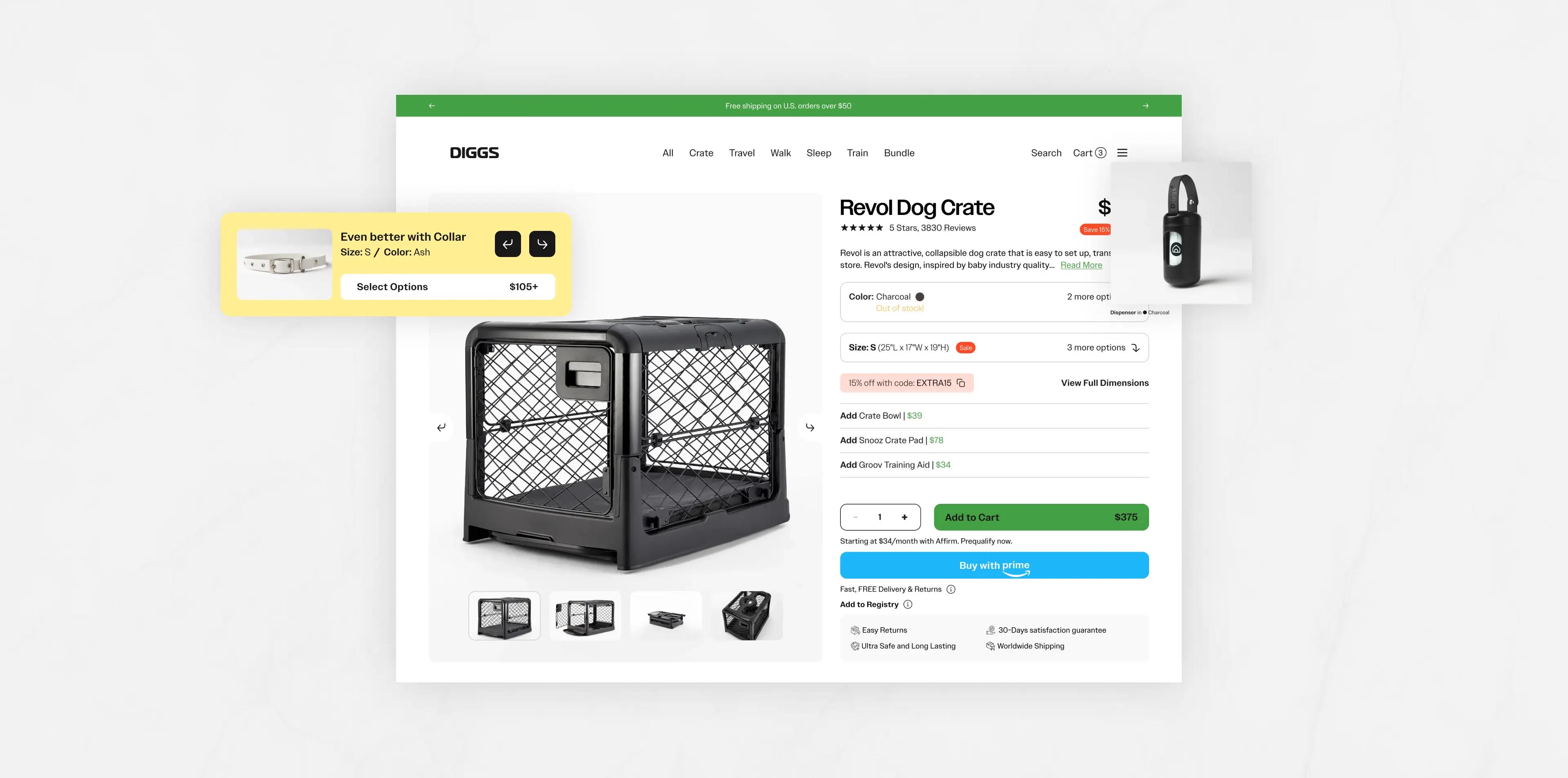
Designed and executed numerous A/B tests, fine-tuning elements of their site, particularly focused on Product Detail Pages (PDP), with the aim of optimizing conversion rates and user engagement.
As Diggs experienced significant growth, they ventured into introducing new and complementary products that perfectly complemented their offerings, which gave rise to the need for bundle products, a seamless way to package essential items together.
To accommodate these advancements, our team integrated new features and components, and developed an additional Bundle Product Detail Page, providing the Diggs team with the capability to effortlessly curate bundles from their product list.
This addition was warmly received by users, offering them a clear, convenient path to assembling everything they need for a comprehensive experience. As a result, this strategic implementation yielded a substantial boost in sales, underscoring the effectiveness and appeal of the bundle approach for both Diggs and their satisfied customers.

Diggs' next online frontier
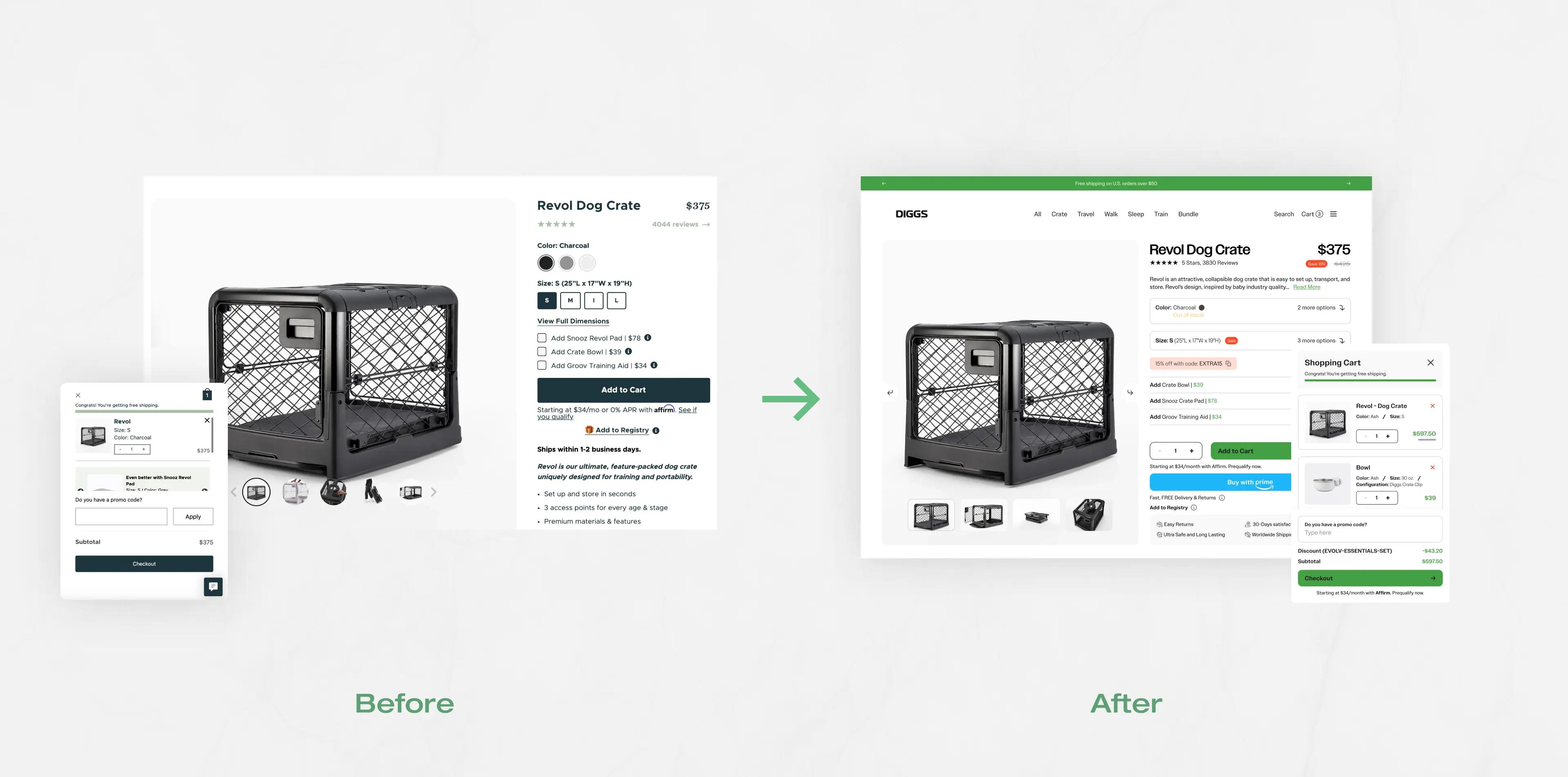
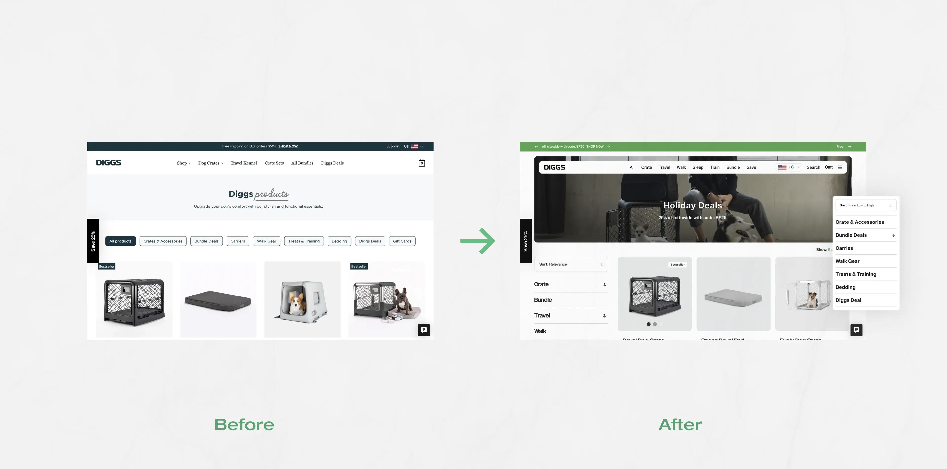
After consistently delivering successful outcomes for Diggs, we are embarking on an extensive redesign and overhaul of their online store. With a fresh perspective and cutting-edge design concepts, we aim to elevate Diggs’ online presence to new heights, further enhancing the user experience and reinforcing its position as a leader in the industry.
In conclusion, the partnership between Diggs and Sogody’s Spell & Sell has been nothing short of transformative. Diggs, driven by a passion for dogs and a commitment to redefining pet ownership, found in Spell & Sell a like-minded partner dedicated to enhancing their online presence and user experience. Together, we embarked on a journey that not only met but exceeded the evolving needs of Diggs and their growing customer base.
Stay posted for more ‘tail-wagging’ announcements!

Not there yet?
Unsure with your needs? or if you have any questions, book a call with us. we’d be happy to explore how we can create a plan that fits you perfectly.
